Flow Reporting and Export
Every gate in a Cytometry analysis has its own statistics. This page covers reading and comparing those statistics, charting them, and exporting them along with your plots and the experiment details you record.
Gate Statistics
Click the box with the gate's name, on the arrow below its plot, or choose Show Stats from the box's ⋮ menu. Analyze Flow Cytometry Data shows where it sits.
The dialog box title shows the gate's name and its event count. The gate's note, if it has one, sits above the table. Each row is a parameter and each column is a statistic. Time and event-number parameters are left out, because they record when and in what order events were acquired.
Choose the Columns
Seven statistics show by default: mean, median, geometric mean, standard deviation, %CV, minimum, and maximum. To add the rest, click Columns at the top of the dialog box and tick them. The extras include rCV, the quartiles and IQR, the 5th, 10th, 90th, and 95th percentiles, skewness, and kurtosis.
The ⋮ menu beside it starts with Send to Data Table and Export stats CSV, covered further down this page. Below them are the same actions as the gate badge's ⋮ menu, such as Rename, Add Note, New Plot, Export FCS, and Delete Gate. Renaming the gate or writing its note happens right in the dialog box.
Warnings in the Statistics
Some numbers are flagged because they are probably unreliable:
- A parameter is flagged as saturated when its 95th percentile reaches 98% of the detector's range. Its Max cell is highlighted.
- A %CV above 50% is flagged as high variation.
- A gate with no events, or fewer than 50, shows a warning at the top of the dialog box and on the gate itself.
Export Every Gate to Excel
Tip: Export stats CSV writes an Excel workbook covering every gate in the analysis, so the statistics for the full hierarchy land in one file.
The workbook holds:
- A Compensation line at the top, reading Compensated or Uncompensated. Numbers measured one way can't be compared with numbers measured the other.
- A section for each population, with its event count, its percent of parent and of total, its note if it has one, and its full table of parameters by statistic.
- Five sections for each quadrant gate, one for the quadrant and one for each corner. Each corner is named for the two conditions that define it, so a CD4 against CD8 quadrant gives CD4/CD8 CD4+ CD8+, CD4/CD8 CD4- CD8+, and so on. A corner you named keeps its two conditions beside the name, such as Tregs (CD4+ CD25+).
- The warnings from the screen, as shaded cells. Saturation and high variation are red, empty gates and gates with very few events have their own shades, and gate notes are blue. A legend at the bottom explains the colors.
Every Population at Once
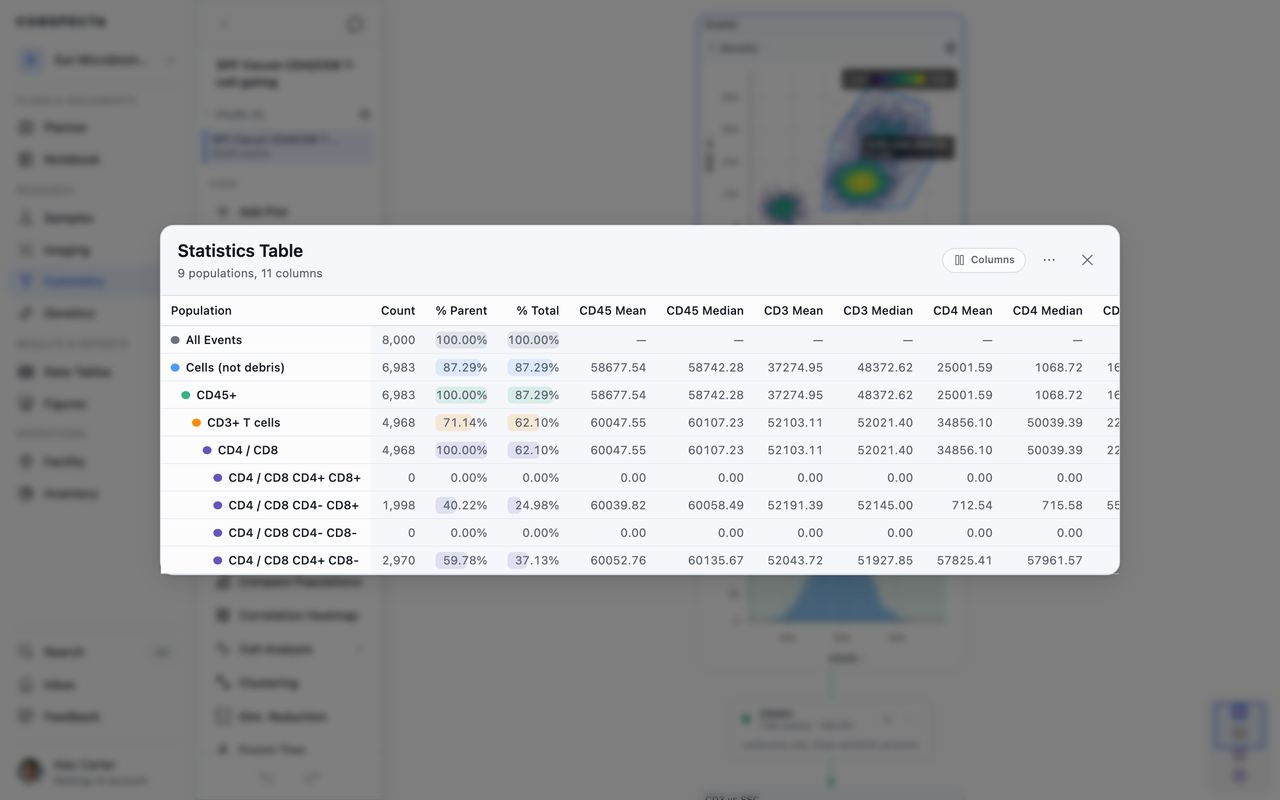
Click Statistics Table in the Analysis section of the sidebar to see every population on one screen. It turns on once you've drawn a gate. Before then, hover it to see why.
Each row is a population, starting with All Events, and each column is a statistic. The table opens on count, percent of parent, and percent of total, plus the mean and median of every fluorescence channel. Scatter and time channels are left off.
- Columns has three rows of toggles: Population statistics, Statistics for each channel, and Channels. Every statistic you turn on shows for every channel you turn on, so turning on Geo Mean adds it to all of them, and turning off a channel removes all of its columns. All and None set every channel at once, and Restore defaults puts the opening set back.
- Turn on Distribution to draw each population's histogram for each channel inside the cell.
- Geo Mean reads n/a when any event in the population is at or below zero, which is common after compensation. Use Median for those channels.
- Click a column heading to sort by it, for example to find the largest population or the dimmest marker. All Events stays at the top.
- The ⋯ menu holds Copy table, which you can paste into a spreadsheet, Send to Data Table, and Export CSV.
All three menu actions take every population. To report on a few, copy or export the table and delete the rows you don't need.
Asking Whether Two Populations Differ
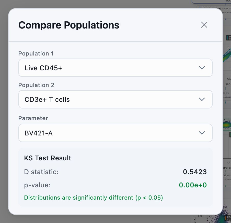
Compare Populations, below Statistics Table in the sidebar, runs a Kolmogorov-Smirnov test. Pick two populations and a channel, and you see the D statistic and the p-value. When the p-value is below 0.05, the result reads Distributions are significantly different (p < 0.05).
The test compares the whole shape of each distribution, so it picks up a population that has split into two peaks even when the means match. It needs two gates. Before then, hover it to see why.
Seeing Which Markers Move Together
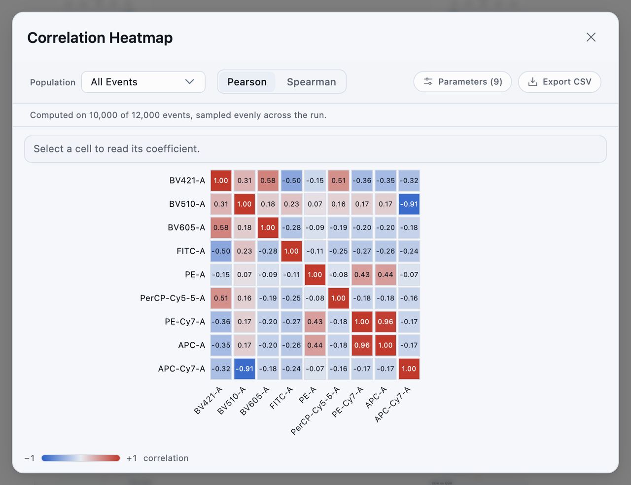
Correlation Heatmap, below Compare Populations, plots every fluorescence channel against every other one. Each square is colored by how closely the pair tracks. Red is positive, blue is negative, and pale gray is no relationship. A scale under the grid maps the colors to numbers.
Read the Grid
Hover a square to see both channel names and the coefficient in the bar above the grid. On a phone, tap it. Once you've clicked into the grid, the arrow keys move one square at a time.
A channel that never varies has no correlation. Its squares are hatched and read n/a, so you can tell a dead detector from a channel with zero correlation.
Choose the Population and Channels
- Population limits the calculation to the cells inside one gate. Use it to check whether two markers travel together inside your CD4 cells, for example.
- Pearson measures a straight-line relationship. Spearman measures rank order, which holds up better on a skewed channel.
- Parameters opens the channel list, and the button shows how many are on. At least two must be on before the grid draws. On a long panel, a Filter channels box appears at the top of the list.
- Export CSV writes the matrix to a file.
Scatter and time channels aren't in the list, because the grid compares fluorescence markers.
Which Events Are Used
The heatmap uses the values the plots show, so with compensation applied it correlates compensated values. It works on any loaded file, gated or not.
Coefficients come from up to 10,000 events, spaced evenly across the file so they cover the full acquisition. When a file has more, a line under the controls says how many events were used and roughly how far apart they were. The exported CSV starts with the same line. A smaller file is read in full and shows no line.
Comparing Across Files
Once two or more files are loaded, Compare and Statistics appear on the bar above the plots. Each opens a table with a row per file.
Batch Statistics
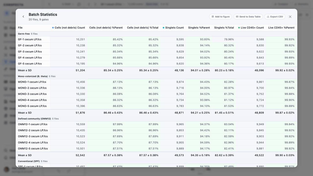
Compare applies your gates to the files you pick and opens Batch Statistics.
- Each population gets three columns: count, percent of parent, and percent of total.
- A quadrant gets five sets of columns, one for itself and one for each corner, named the same way as in the Excel export, such as CD4/CD8 CD4+ CD8+.
- A Mean ± SD row at the bottom gives the mean and standard deviation of each percentage, and the total count. With conditions assigned, the rows are grouped by condition instead, and each group ends on its own Mean ± SD row. Files in no condition are grouped under Unassigned, and sorting a column sorts within each group.
- Percentages below 5% are tinted red and those above 80% green, so a failed tube stands out.
- A line above the table counts the files where a gate couldn't be placed on their channels.
Add to figure, Send to Data Table, and Export CSV sit at the top of the table. With conditions assigned, the CSV starts with a Condition column.
Aggregate Statistics
Statistics opens Aggregate Statistics, which adds condition bands, outlier flags, and significance tests. Flow files and templates covers it.
Sending Statistics to a Data Table
Four screens can send their numbers to Data Tables:
| Screen | Where to click | What it sends |
|---|---|---|
| A gate's statistics | Send to Data Table in the ⋮ menu | That gate's statistics |
| Statistics Table | Send to Data Table in the ⋯ menu | Every population |
| Batch Statistics | Send to Data Table | Counts and percentages for every file |
| Aggregate Statistics | Send comparison to a Data Table | Counts and percentages for every file |
The new table is named after the analysis, such as "T cell panel, flow stats" or "T cell panel, sample comparison". You stay in the analysis, and the confirmation has an Open button that takes you to the table. From there you can chart it, run a test on it, join it to another table, or export it as Excel.
- The table is a snapshot of the numbers when you sent it. Re-gating leaves it as it was, so a figure built on it keeps its numbers. Send it again to get the current numbers.
- The table is shared with the project, even when the analysis is private. To keep it to yourself, choose Make private on its menu in Data Tables.
Tip: The Sample column always comes first in these tables, so a chart built from one groups by sample with no setup.
Sending to a table and adding to a figure both create something, so project members with view-only access don't see them. Anyone can export a CSV or a spreadsheet.
Charts and Figures
Each analysis keeps its statistics in a table of its own, updated as you gate. You chart that table in Figures or on a notes page. It follows the analysis's sharing. The numbers from an analysis you keep private stay yours, and sharing the analysis shares them with the project.
The table has rows for every file loaded in the analysis, so a chart from a multi-file analysis compares all your samples. The file you have open carries its full set of marker statistics, and the other files carry counts and percentages. Each corner of a quadrant gets its own row, so a double-positive frequency charts across samples.
Chart the Statistics
When you add a chart from a flow analysis, pick one of these views:
- Frequency (% of parent) or Event count by population
- Population composition as a stacked proportion
- Median intensity heatmap across markers
- A marker's median by population
- Any dot plot from your analysis, drawn from the FCS data
A notes page offers the same views apart from the dot plot. Insert a Chart, pick the analysis, then pick the view. For a marker's median, pick the marker last.
Add a Plot to a Figure
Add to figure on a plot's Plot actions menu puts that dot plot on a figure. Pick an existing figure or name a new one, and the plot becomes a panel. The panel stays linked to the FCS data, so re-gating the plot updates the figure.
Add to figure on the Batch Statistics screen adds the file comparison to a figure as a panel.
A plot panel shows a small Compensated or Uncompensated label in its corner, and the label appears in the exported image. Two panels of the same plot, one made with a matrix applied and one without, look alike otherwise. Panels made before Conspecta recorded this have no label.
Exporting Figures
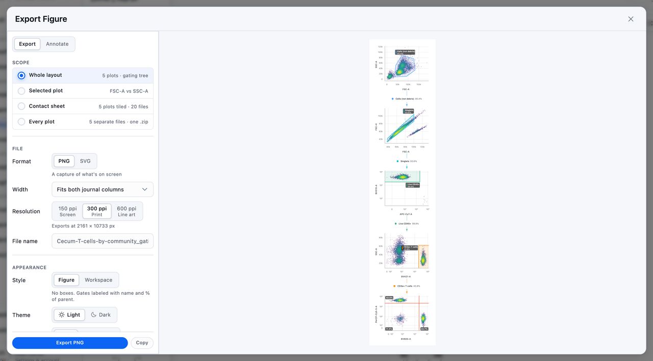
You export pictures from the Export Figure screen, which shows the figure beside its export settings. There are two ways to open it:
- Export Figure in the Analysis section of the sidebar opens it on the whole gating tree.
- Export plot on a plot's Plot actions menu opens it on that plot.
You can change what it captures once it's open.
What to Capture
| Capture | What it exports |
|---|---|
| Whole layout | The gating tree as it sits on the canvas |
| Selected plot | One plot on its own. Select a plot first |
| Contact sheet | Every plot tiled into one image, sized for a single slide |
| Every plot | One file per plot, all inside a single .zip |
Plots are captured as they look on screen, with their gates, statistics, and population and sample keys. Set them up the way you want them first.
Every plot produces one archive named for the analysis and today's date.
Font and Gates on a Single Plot
Pick Selected plot and SVG together and two more settings appear:
- Font, the typeface the file's text is set in
- Include gates, which keeps or drops the gate outlines and their labels
To change an axis name, use Rename Parameters before you export. To add a title, write it with the Annotate tab. Both show in the preview.
Size, Format, and File Name
Size is set in the units a journal asks for:
| Setting | Choices |
|---|---|
| Width | Fits one journal column (89 mm), Fits both journal columns (183 mm), Fills a presentation slide (254 mm), or a Custom width in millimeters |
| Resolution | 150 ppi for screen, 300 ppi for print, or 600 ppi for line art. An SVG prints at the chosen width at any resolution |
With PNG selected, the panel shows the pixel size those settings produce, so you can check a submission requirement before you export.
Export PNG or Export SVG writes the file. With PNG, Copy puts the picture on your clipboard for pasting into a slide. It isn't offered for Every plot.
The file name is filled in from the analysis, what you captured, and today's date, such as T-cell-panel_gating-tree_2026-08-04. Type your own name to replace it.
Style, Theme, Background, and Legends
- Style starts on Figure, which suits a manuscript: the plots have no border, and each gate on the tree is labeled with its color, name, and percent of parent, such as "Lymphocytes 62.3%". Workspace keeps the bordered card each plot sits in on screen and labels each gate as the canvas does, with its event count and note.
- Theme starts on Light, whichever theme the app is in. Dark draws the plots, their labels, and the background the way the dark theme shows them, for a slide with a dark background.
- Background is White or Transparent, and White reads Dark once the theme is Dark. Transparent suits a slide with a color behind it. Word and PowerPoint show transparency as black, so pick White or Dark for those.
- Legends starts on Per plot, so each plot keeps the legend setting from its own Plot style panel. All and None show or hide the legend on every plot for this export only and leave your plots unchanged. Pick None when the key goes in the caption.
Annotating Before You Export
You can draw text, arrows, shapes, and scale bars in two places:
| Where | What it draws on | What happens to the marks |
|---|---|---|
| Annotate in the Tools section of the sidebar | The gating tree itself | They save with the analysis, come back when you reopen it, and appear in the Whole layout capture |
| The Annotate tab beside Export on the Export Figure screen | The figure you're about to export | They go into that one file. Change the capture and the figure redraws without them, and closing the screen discards them |
Marks reach a PNG as pixels and an SVG as shapes you can still move and recolor. Undo and redo for them sit at the foot of the Annotate tab, and ⌘Z (Ctrl+Z on Windows) works from either tab.
The Annotate tab works on Whole layout, Selected plot, and Contact sheet, which each produce one picture. It's grayed out for Every plot.
What an SVG Contains
SVG works for every capture, including the full gating tree. Each plot's events stay a raster layer, because there are far too many to draw one by one. Everything you'd want to restyle is vector on top of them: gate outlines, gate labels, axis names, the density ramp or color key, the connector arrows, and each connector's gate name and percentage.
Open the file in Illustrator or Inkscape to retype a gate name, recolor an outline, or move a label without touching the data underneath.
Exporting Data
Export a Gated Population
Export FCS on a gate's ⋮ menu writes that population as an FCS file, with the gate's name in the file's keywords. Send it to a collaborator or open it in other flow software.
Export Statistics From the Analysis Tab
On the Cytometry page, open the Analysis tab, click Export, and choose The population statistics. You get one Excel or CSV file for each analysis in the scope you pick, zipped together when there's more than one. Each file has a row per population per FCS file, with its count, its frequencies, and each parameter's statistics.
Statistics are saved as you gate, so an analysis you haven't gated yet has none. When only some in the scope have been gated, the dialog box says how many have statistics saved.
Export the Raw Files and Gating
To export the FCS files and gating hierarchies for the project, go to Settings → Export and tick Flow Cytometry. It produces a ZIP.
Recording Context
Experiment Metadata
Experiment Metadata records what the numbers were measured on. To open it, click the analysis name at the top of the screen. It sits in Analysis details, below the notes.
Seven fields are offered, and none is required:
- Experiment Date
- Instrument
- Operator
- Condition
- Timepoint
- Patient ID
- Panel
Click a field to fill it in. It saves when you click away or press Enter, and Esc leaves it as it was.
To add a field of your own, type a name and a value in the row at the bottom and click Add. To remove one you added, hover it and click the ×, which asks first when the field holds a value. An analysis holds up to 50 fields, with names up to 64 characters and values up to 500. Project members with view-only access don't see these fields.
Gate Notes
A gate note records why a gate sits where it does, such as "set at FMO + 2 SD" or "based on isotype control". Choose Add Note from a gate's ⋮ menu. The note appears in the gate's box on the arrow below its plot, in its statistics, in the gating path above the plots, and in the Excel export, so anyone who opens the analysis later can read your reasoning.
Data-Quality Warnings
A banner above the plots warns you when:
- A file carries a spillover matrix that hasn't been applied. If you can edit the analysis, this shows as the compensation banner with View and Apply, described in Compensation.
- The file you have open has fewer than 1,000 events.
- The applied compensation matrix covers only some of a file's channels, so those signals are uncorrected. Review matrix opens the compensation dialog box.
- A gate's plot has been deleted, so Conspecta can't confirm the axis scaling it was drawn on. Add a plot with the same parameters and parent gate to restore it.
The banner shows one warning at a time. Click Details, or +2 more when there are several, to see them all. The × on a warning hides it in that analysis until you close the browser tab.
Smaller checks sit beside what they flag. Saturation and high variation are flagged in the statistics cells, and empty or nearly empty gates are flagged on the gate. None of the warnings stop you from working.