Tumor models, immune phenotyping, and tissue imaging in one project
A preclinical cancer study produces caliper measurements, FCS files, stained sections, and a survival curve, usually in four different tools. Conspecta keeps all of it attached to the animal and the treatment arm it came from.
The preclinical cancer workflow, in one browser tab
Growth
Record volumes and endpoints in a data table attached to the same animal its flow files and tissue images hang off, so a growth curve and an endpoint phenotype describe one mouse. Click from a fast-growing tumor to the flow data measured from it.
Phenotyping
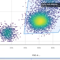
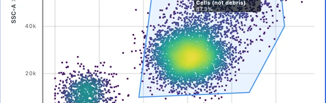
Compensation and multicolor gating in any browser, saved as a template the whole lab gates from. Every FCS file is linked to the tumor it was dissociated from, so the arm and timepoint of that sample come with it into the gate statistics.
Clustering
SOM and graph clustering (FlowSOM-style and PhenoGraph-style), K-means, and DBSCAN, plus UMAP, t-SNE, and PCA, running in the browser with nothing to install. You run it yourself, the week the cohort comes down.
Imaging
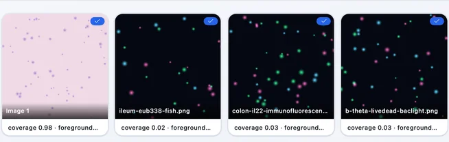
Open an image and a segmentation model counts every cell, with no threshold to tune. Marker intensity, area, and colocalization (Pearson's, Manders', Costes) on LIF, TIFF, and PNG fields, with one detection setup reused across the whole cohort. The settings behind a result stay stored with it, so a repeat next season starts from the setup that produced the first one.
Plots
Charts are built from the gated populations and image measurements themselves. Re-gate or re-run a detection and the numbers downstream follow, and every chart still names the analysis behind it.
Cohorts
Treatment arm, timepoint, and model are fields on the sample, so you filter the study down to anti-PD-1, day 21, cage 3 and get exactly those files. Every measurement made from that animal carries the same context into every plot and figure.
Writing
Notes, flow analysis, image analysis, and multi-panel figures sit in one project, and the figure is built from the analysis rather than pasted beside it. An entry points at the gate it describes, so re-running that analysis reaches the panel in the figure.
%22%2F%3E%3Cellipse%20cx%3D%22155.4%22%20cy%3D%22135.2%22%20rx%3D%2211.8%22%20ry%3D%227.7%22%20fill%3D%22url(%23n)%22%2F%3E%3Cellipse%20cx%3D%22325.9%22%20cy%3D%22410%22%20rx%3D%228%22%20ry%3D%227.4%22%20fill%3D%22url(%23n)%22%2F%3E%3Cellipse%20cx%3D%22864.8%22%20cy%3D%22557%22%20rx%3D%2210.6%22%20ry%3D%2214.6%22%20fill%3D%22url(%23n)%22%2F%3E%3Cellipse%20cx%3D%22593%22%20cy%3D%22166.5%22%20rx%3D%229%22%20ry%3D%227.5%22%20fill%3D%22url(%23n)%22%2F%3E%3Cellipse%20cx%3D%22866.8%22%20cy%3D%22688.5%22%20rx%3D%2216.2%22%20ry%3D%2210.4%22%20fill%3D%22url(%23n)%22%2F%3E%3Cellipse%20cx%3D%22864.7%22%20cy%3D%22112.4%22%20rx%3D%229.7%22%20ry%3D%2212.6%22%20fill%3D%22url(%23n)%22%2F%3E%3Cellipse%20cx%3D%22108%22%20cy%3D%22564.4%22%20rx%3D%2216.8%22%20ry%3D%2213%22%20fill%3D%22url(%23n)%22%2F%3E%3Cellipse%20cx%3D%22443.7%22%20cy%3D%22658%22%20rx%3D%228.7%22%20ry%3D%228.6%22%20fill%3D%22url(%23n)%22%2F%3E%3Cellipse%20cx%3D%22982.4%22%20cy%3D%22500.3%22%20rx%3D%2211.1%22%20ry%3D%229.5%22%20fill%3D%22url(%23n)%22%2F%3E%3Cellipse%20cx%3D%22281.9%22%20cy%3D%22714.3%22%20rx%3D%2215.1%22%20ry%3D%2211.6%22%20fill%3D%22url(%23n)%22%2F%3E%3Cellipse%20cx%3D%22617.2%22%20cy%3D%22695.3%22%20rx%3D%226.3%22%20ry%3D%229.6%22%20fill%3D%22url(%23n)%22%2F%3E%3Cellipse%20cx%3D%221238%22%20cy%3D%22545.8%22%20rx%3D%227.4%22%20ry%3D%228.4%22%20fill%3D%22url(%23n)%22%2F%3E%3Cellipse%20cx%3D%22325.6%22%20cy%3D%22209.7%22%20rx%3D%226.9%22%20ry%3D%2211.7%22%20fill%3D%22url(%23n)%22%2F%3E%3Cellipse%20cx%3D%221210.7%22%20cy%3D%22202.4%22%20rx%3D%2210.3%22%20ry%3D%228.3%22%20fill%3D%22url(%23n)%22%2F%3E%3Cellipse%20cx%3D%221204.8%22%20cy%3D%22307.9%22%20rx%3D%2211.8%22%20ry%3D%2216.4%22%20fill%3D%22url(%23n)%22%2F%3E%3Cellipse%20cx%3D%22711.5%22%20cy%3D%22654.2%22%20rx%3D%226.5%22%20ry%3D%227.6%22%20fill%3D%22url(%23n)%22%2F%3E%3Cellipse%20cx%3D%221041.1%22%20cy%3D%22647.8%22%20rx%3D%2211.4%22%20ry%3D%229.4%22%20fill%3D%22url(%23n)%22%2F%3E%3Cellipse%20cx%3D%221113.7%22%20cy%3D%22101.1%22%20rx%3D%2211.1%22%20ry%3D%2212.6%22%20fill%3D%22url(%23n)%22%2F%3E%3Cellipse%20cx%3D%22388.6%22%20cy%3D%22449.3%22%20rx%3D%2210.9%22%20ry%3D%227.9%22%20fill%3D%22url(%23n)%22%2F%3E%3Cellipse%20cx%3D%22538.6%22%20cy%3D%22309.8%22%20rx%3D%2213%22%20ry%3D%228.6%22%20fill%3D%22url(%23n)%22%2F%3E%3Cellipse%20cx%3D%22863.5%22%20cy%3D%22308.7%22%20rx%3D%2218.2%22%20ry%3D%2212.2%22%20fill%3D%22url(%23n)%22%2F%3E%3Cellipse%20cx%3D%22393%22%20cy%3D%22366.3%22%20rx%3D%2212.3%22%20ry%3D%2212.1%22%20fill%3D%22url(%23n)%22%2F%3E%3Cellipse%20cx%3D%22308.2%22%20cy%3D%22438.9%22%20rx%3D%2213.3%22%20ry%3D%228.9%22%20fill%3D%22url(%23n)%22%2F%3E%3Cellipse%20cx%3D%22265.1%22%20cy%3D%22179.3%22%20rx%3D%228.7%22%20ry%3D%227.9%22%20fill%3D%22url(%23n)%22%2F%3E%3Cellipse%20cx%3D%2265.9%22%20cy%3D%22718.5%22%20rx%3D%2211.5%22%20ry%3D%228%22%20fill%3D%22url(%23n)%22%2F%3E%3Cellipse%20cx%3D%22801.3%22%20cy%3D%22281.5%22%20rx%3D%2212.1%22%20ry%3D%229.7%22%20fill%3D%22url(%23n)%22%2F%3E%3Cellipse%20cx%3D%22740.1%22%20cy%3D%22392.7%22%20rx%3D%2211.9%22%20ry%3D%228.5%22%20fill%3D%22url(%23n)%22%2F%3E%3Cellipse%20cx%3D%22573.3%22%20cy%3D%22295.8%22%20rx%3D%2210.5%22%20ry%3D%229.4%22%20fill%3D%22url(%23n)%22%2F%3E%3Cellipse%20cx%3D%22755.2%22%20cy%3D%22560.8%22%20rx%3D%2210.6%22%20ry%3D%229.6%22%20fill%3D%22url(%23n)%22%2F%3E%3Cellipse%20cx%3D%22267.8%22%20cy%3D%22627.6%22%20rx%3D%2217.3%22%20ry%3D%2211.6%22%20fill%3D%22url(%23n)%22%2F%3E%3Cellipse%20cx%3D%221130.4%22%20cy%3D%22447.5%22%20rx%3D%2215.2%22%20ry%3D%2210.1%22%20fill%3D%22url(%23n)%22%2F%3E%3Cellipse%20cx%3D%22203.4%22%20cy%3D%22234.4%22%20rx%3D%2210.7%22%20ry%3D%227.7%22%20fill%3D%22url(%23n)%22%2F%3E%3Cellipse%20cx%3D%2275.2%22%20cy%3D%22725.6%22%20rx%3D%229%22%20ry%3D%2212.7%22%20fill%3D%22url(%23n)%22%2F%3E%3Cellipse%20cx%3D%221256.6%22%20cy%3D%22491.8%22%20rx%3D%228.2%22%20ry%3D%2212.8%22%20fill%3D%22url(%23n)%22%2F%3E%3Cellipse%20cx%3D%221218.6%22%20cy%3D%22552.6%22%20rx%3D%229.1%22%20ry%3D%229.9%22%20fill%3D%22url(%23n)%22%2F%3E%3Cellipse%20cx%3D%221211.5%22%20cy%3D%2248.9%22%20rx%3D%2213.7%22%20ry%3D%229.9%22%20fill%3D%22url(%23n)%22%2F%3E%3Cellipse%20cx%3D%22545.5%22%20cy%3D%22570.3%22%20rx%3D%228.7%22%20ry%3D%2212.1%22%20fill%3D%22url(%23n)%22%2F%3E%3Cellipse%20cx%3D%221253.7%22%20cy%3D%22163.9%22%20rx%3D%2212.4%22%20ry%3D%229.3%22%20fill%3D%22url(%23n)%22%2F%3E%3Cellipse%20cx%3D%22381.2%22%20cy%3D%22293.3%22%20rx%3D%226.8%22%20ry%3D%227.3%22%20fill%3D%22url(%23n)%22%2F%3E%3Cellipse%20cx%3D%22478.4%22%20cy%3D%22450.7%22%20rx%3D%228.7%22%20ry%3D%2212.6%22%20fill%3D%22url(%23n)%22%2F%3E%3Cellipse%20cx%3D%22187.2%22%20cy%3D%22493%22%20rx%3D%2210.3%22%20ry%3D%2210.5%22%20fill%3D%22url(%23n)%22%2F%3E%3Cellipse%20cx%3D%22140.8%22%20cy%3D%2279.2%22%20rx%3D%227.5%22%20ry%3D%2212.6%22%20fill%3D%22url(%23n)%22%2F%3E%3Cellipse%20cx%3D%221214.1%22%20cy%3D%2267.1%22%20rx%3D%2211.4%22%20ry%3D%228%22%20fill%3D%22url(%23n)%22%2F%3E%3Cellipse%20cx%3D%22749.8%22%20cy%3D%22731.1%22%20rx%3D%228.8%22%20ry%3D%227.2%22%20fill%3D%22url(%23n)%22%2F%3E%3Cellipse%20cx%3D%22353%22%20cy%3D%22185.4%22%20rx%3D%2211.6%22%20ry%3D%229.8%22%20fill%3D%22url(%23n)%22%2F%3E%3Cellipse%20cx%3D%22787.5%22%20cy%3D%22338.4%22%20rx%3D%227.3%22%20ry%3D%2212.6%22%20fill%3D%22url(%23n)%22%2F%3E%3Cellipse%20cx%3D%22909.2%22%20cy%3D%22357.8%22%20rx%3D%229.6%22%20ry%3D%2213.5%22%20fill%3D%22url(%23n)%22%2F%3E%3Cellipse%20cx%3D%22866%22%20cy%3D%22270.2%22%20rx%3D%229.5%22%20ry%3D%2216%22%20fill%3D%22url(%23n)%22%2F%3E%3Cellipse%20cx%3D%22309.4%22%20cy%3D%22661%22%20rx%3D%229.6%22%20ry%3D%2210.5%22%20fill%3D%22url(%23n)%22%2F%3E%3Cellipse%20cx%3D%221070.5%22%20cy%3D%22632.4%22%20rx%3D%228.3%22%20ry%3D%228.7%22%20fill%3D%22url(%23n)%22%2F%3E%3Cellipse%20cx%3D%22523.5%22%20cy%3D%22142.5%22%20rx%3D%228%22%20ry%3D%2210.6%22%20fill%3D%22url(%23n)%22%2F%3E%3Cellipse%20cx%3D%22460.4%22%20cy%3D%22174.8%22%20rx%3D%2212%22%20ry%3D%2212.5%22%20fill%3D%22url(%23n)%22%2F%3E%3Cellipse%20cx%3D%221114.4%22%20cy%3D%22373%22%20rx%3D%229%22%20ry%3D%2214.5%22%20fill%3D%22url(%23n)%22%2F%3E%3Cellipse%20cx%3D%22504.3%22%20cy%3D%22344.7%22%20rx%3D%228.8%22%20ry%3D%2210%22%20fill%3D%22url(%23n)%22%2F%3E%3Cellipse%20cx%3D%22893.5%22%20cy%3D%22545.6%22%20rx%3D%2210.5%22%20ry%3D%2213.8%22%20fill%3D%22url(%23n)%22%2F%3E%3Cellipse%20cx%3D%22111.8%22%20cy%3D%22262%22%20rx%3D%2211.2%22%20ry%3D%227.7%22%20fill%3D%22url(%23n)%22%2F%3E%3Cellipse%20cx%3D%221021.1%22%20cy%3D%2251.9%22%20rx%3D%2212.5%22%20ry%3D%228.9%22%20fill%3D%22url(%23n)%22%2F%3E%3Cellipse%20cx%3D%221193.6%22%20cy%3D%22351.6%22%20rx%3D%2213.3%22%20ry%3D%2210.2%22%20fill%3D%22url(%23n)%22%2F%3E%3Cellipse%20cx%3D%221107.9%22%20cy%3D%22523.3%22%20rx%3D%2211.7%22%20ry%3D%2210.2%22%20fill%3D%22url(%23n)%22%2F%3E%3Cellipse%20cx%3D%22579.2%22%20cy%3D%22483.3%22%20rx%3D%2211.8%22%20ry%3D%229.5%22%20fill%3D%22url(%23n)%22%2F%3E%3Cellipse%20cx%3D%22273.9%22%20cy%3D%22492.6%22%20rx%3D%2214.2%22%20ry%3D%229.7%22%20fill%3D%22url(%23n)%22%2F%3E%3Cellipse%20cx%3D%22342.2%22%20cy%3D%2241.2%22%20rx%3D%228.6%22%20ry%3D%229.3%22%20fill%3D%22url(%23n)%22%2F%3E%3Cellipse%20cx%3D%221175.7%22%20cy%3D%22177.2%22%20rx%3D%2212.1%22%20ry%3D%228%22%20fill%3D%22url(%23n)%22%2F%3E%3Cellipse%20cx%3D%221009.1%22%20cy%3D%22162.2%22%20rx%3D%2212.8%22%20ry%3D%2213.1%22%20fill%3D%22url(%23n)%22%2F%3E%3Cellipse%20cx%3D%22908%22%20cy%3D%22712%22%20rx%3D%228.3%22%20ry%3D%2213.4%22%20fill%3D%22url(%23n)%22%2F%3E%3Cellipse%20cx%3D%221159.4%22%20cy%3D%22558.7%22%20rx%3D%2210.5%22%20ry%3D%228.9%22%20fill%3D%22url(%23n)%22%2F%3E%3Cellipse%20cx%3D%22154.6%22%20cy%3D%2279.7%22%20rx%3D%228.5%22%20ry%3D%229.6%22%20fill%3D%22url(%23n)%22%2F%3E%3Cellipse%20cx%3D%22224.4%22%20cy%3D%22358.1%22%20rx%3D%2211.6%22%20ry%3D%2212.6%22%20fill%3D%22url(%23n)%22%2F%3E%3Cellipse%20cx%3D%221051.7%22%20cy%3D%22167.9%22%20rx%3D%2211.6%22%20ry%3D%227.5%22%20fill%3D%22url(%23n)%22%2F%3E%3Cellipse%20cx%3D%2272%22%20cy%3D%22469.1%22%20rx%3D%2210.6%22%20ry%3D%227.9%22%20fill%3D%22url(%23n)%22%2F%3E%3Cellipse%20cx%3D%221191.6%22%20cy%3D%22274.6%22%20rx%3D%228.9%22%20ry%3D%229.4%22%20fill%3D%22url(%23n)%22%2F%3E%3Cellipse%20cx%3D%22817.4%22%20cy%3D%22690.6%22%20rx%3D%2211.1%22%20ry%3D%2210.6%22%20fill%3D%22url(%23n)%22%2F%3E%3Cellipse%20cx%3D%2265.6%22%20cy%3D%22571.6%22%20rx%3D%228.8%22%20ry%3D%229.5%22%20fill%3D%22url(%23n)%22%2F%3E%3Cellipse%20cx%3D%22255.4%22%20cy%3D%22307.3%22%20rx%3D%2211.3%22%20ry%3D%2214.1%22%20fill%3D%22url(%23n)%22%2F%3E%3Cellipse%20cx%3D%221235%22%20cy%3D%22149.2%22%20rx%3D%2211.8%22%20ry%3D%228.4%22%20fill%3D%22url(%23n)%22%2F%3E%3Cellipse%20cx%3D%221248.8%22%20cy%3D%2267.6%22%20rx%3D%2212.1%22%20ry%3D%229.9%22%20fill%3D%22url(%23n)%22%2F%3E%3Cellipse%20cx%3D%22846.1%22%20cy%3D%22688.1%22%20rx%3D%228.8%22%20ry%3D%229.3%22%20fill%3D%22url(%23n)%22%2F%3E%3Cellipse%20cx%3D%22546.3%22%20cy%3D%22233.5%22%20rx%3D%2213.7%22%20ry%3D%2211.2%22%20fill%3D%22url(%23n)%22%2F%3E%3Cellipse%20cx%3D%22630.1%22%20cy%3D%22705.8%22%20rx%3D%2212.1%22%20ry%3D%2211.5%22%20fill%3D%22url(%23n)%22%2F%3E%3Cellipse%20cx%3D%22664.5%22%20cy%3D%22343.7%22%20rx%3D%229.4%22%20ry%3D%2210.4%22%20fill%3D%22url(%23n)%22%2F%3E%3Cellipse%20cx%3D%22725.5%22%20cy%3D%22286.4%22%20rx%3D%2212.1%22%20ry%3D%2210.1%22%20fill%3D%22url(%23n)%22%2F%3E%3Cellipse%20cx%3D%22876.3%22%20cy%3D%22290.9%22%20rx%3D%2212.1%22%20ry%3D%2211.7%22%20fill%3D%22url(%23n)%22%2F%3E%3Cellipse%20cx%3D%22738.6%22%20cy%3D%22569.4%22%20rx%3D%2212.6%22%20ry%3D%2211.6%22%20fill%3D%22url(%23n)%22%2F%3E%3Cellipse%20cx%3D%22673.6%22%20cy%3D%22714.2%22%20rx%3D%2213.5%22%20ry%3D%2210.2%22%20fill%3D%22url(%23n)%22%2F%3E%3Cellipse%20cx%3D%22431.3%22%20cy%3D%22521.4%22%20rx%3D%2211.1%22%20ry%3D%228.8%22%20fill%3D%22url(%23n)%22%2F%3E%3Cellipse%20cx%3D%22133.3%22%20cy%3D%22269.9%22%20rx%3D%2210.4%22%20ry%3D%229.5%22%20fill%3D%22url(%23n)%22%2F%3E%3Cellipse%20cx%3D%22264.1%22%20cy%3D%22433.8%22%20rx%3D%2213.1%22%20ry%3D%2211.8%22%20fill%3D%22url(%23n)%22%2F%3E%3Cellipse%20cx%3D%22574.8%22%20cy%3D%22456.5%22%20rx%3D%229.4%22%20ry%3D%2216.1%22%20fill%3D%22url(%23n)%22%2F%3E%3Cellipse%20cx%3D%221071.6%22%20cy%3D%22301.6%22%20rx%3D%221.5%22%20ry%3D%221.1%22%20fill%3D%22url(%23n)%22%2F%3E%3Cellipse%20cx%3D%22459.3%22%20cy%3D%22408.6%22%20rx%3D%224.2%22%20ry%3D%222.7%22%20fill%3D%22url(%23n)%22%2F%3E%3Cellipse%20cx%3D%22840.7%22%20cy%3D%22310.8%22%20rx%3D%221.1%22%20ry%3D%221.9%22%20fill%3D%22url(%23n)%22%2F%3E%3Cellipse%20cx%3D%22312.1%22%20cy%3D%22329.6%22%20rx%3D%222.5%22%20ry%3D%223.4%22%20fill%3D%22url(%23n)%22%2F%3E%3Cellipse%20cx%3D%22972.4%22%20cy%3D%22157.6%22%20rx%3D%222.4%22%20ry%3D%221.6%22%20fill%3D%22url(%23n)%22%2F%3E%3Cellipse%20cx%3D%22975.1%22%20cy%3D%22474.6%22%20rx%3D%223.2%22%20ry%3D%225.2%22%20fill%3D%22url(%23n)%22%2F%3E%3Cellipse%20cx%3D%22792%22%20cy%3D%22697.5%22%20rx%3D%222.5%22%20ry%3D%221.8%22%20fill%3D%22url(%23n)%22%2F%3E%3Cellipse%20cx%3D%221137.9%22%20cy%3D%22656.5%22%20rx%3D%223.1%22%20ry%3D%223.4%22%20fill%3D%22url(%23n)%22%2F%3E%3Cellipse%20cx%3D%22186.5%22%20cy%3D%2241.6%22%20rx%3D%224.7%22%20ry%3D%223.1%22%20fill%3D%22url(%23n)%22%2F%3E%3Cellipse%20cx%3D%22113%22%20cy%3D%22521.8%22%20rx%3D%221.8%22%20ry%3D%222.9%22%20fill%3D%22url(%23n)%22%2F%3E%3Cellipse%20cx%3D%2273.3%22%20cy%3D%22589.1%22%20rx%3D%224.2%22%20ry%3D%223.2%22%20fill%3D%22url(%23n)%22%2F%3E%3Cellipse%20cx%3D%22181.5%22%20cy%3D%22644.9%22%20rx%3D%221.9%22%20ry%3D%223%22%20fill%3D%22url(%23n)%22%2F%3E%3Cellipse%20cx%3D%221183.4%22%20cy%3D%22223.7%22%20rx%3D%221.6%22%20ry%3D%221.4%22%20fill%3D%22url(%23n)%22%2F%3E%3Cellipse%20cx%3D%221252.5%22%20cy%3D%22459.9%22%20rx%3D%223%22%20ry%3D%223.3%22%20fill%3D%22url(%23n)%22%2F%3E%3C%2Fsvg%3E)
Questions cancer biology labs ask
Can I gate a tumor panel and run clustering in the browser?
Yes. Compensation, multicolor gating, and statistics all run in the browser, and a strategy saves as a template the whole lab gates from. High-parameter panels get SOM and graph clustering in the style of FlowSOM and PhenoGraph, plus K-means and DBSCAN, with UMAP, t-SNE, and PCA for the projection. Gating you already have comes across from a FlowJo 10 workspace or a Gating-ML 2.0 file, and Conspecta puts its own counts beside the ones the file recorded so you can see whether they agree.
Can I count tumor-infiltrating lymphocytes without scoring by hand?
Yes, on immunofluorescence fields. Open a section, answer a couple of questions about what you are measuring, and Conspecta assembles the detection pipeline, with a segmentation model finding the cells. Marker intensity, positive and negative classification, and colocalization by Pearson's correlation, Manders' coefficients, and Costes significance run on the same images, and the settings that produced a result stay stored with it, so one setup scores the whole cohort the same way.
How do I keep flow data, tissue images, and growth curves on the same animal?
Arm, timepoint, and model are fields on the sample, and every FCS file, stained section, and caliper series measured from that animal hangs off it. Plots group by those axes, so a growth curve and an endpoint phenotype describe one mouse. Fix a mislabeled arm once, at the sample, and every chart and figure built from it follows.
Does Conspecta do whole-slide imaging or digital pathology?
No. The limit is the file: Conspecta reads LIF, TIFF, PNG, JPEG, and BMP, and the gigapixel pyramid formats a slide scanner writes (.svs, .ndpi, .mrxs, .vsi) are outside what it opens. Case and slide workflows, and brightfield H&E scoring across a whole section, are outside its scope too. What it covers is the preclinical loop: flow phenotyping, immunofluorescence quantification, the samples behind both, and the figure at the end.
How much does it cost?
Conspecta is free for you and one collaborator, with no credit card. Academic teams pay one flat rate for the lab rather than a per-seat license, so a rotation student joining the cohort does not add a line to the invoice. Every plan includes every workspace, so the flow work and the imaging come in the same subscription.
See it on your own cohort
Bring one tumor panel or one stained section and see the analysis come back attached to the data it ran on.